Kinn Studio
Heirloom Jewelry for a Modern Consumer

REDEFINING MODERN LUXURY
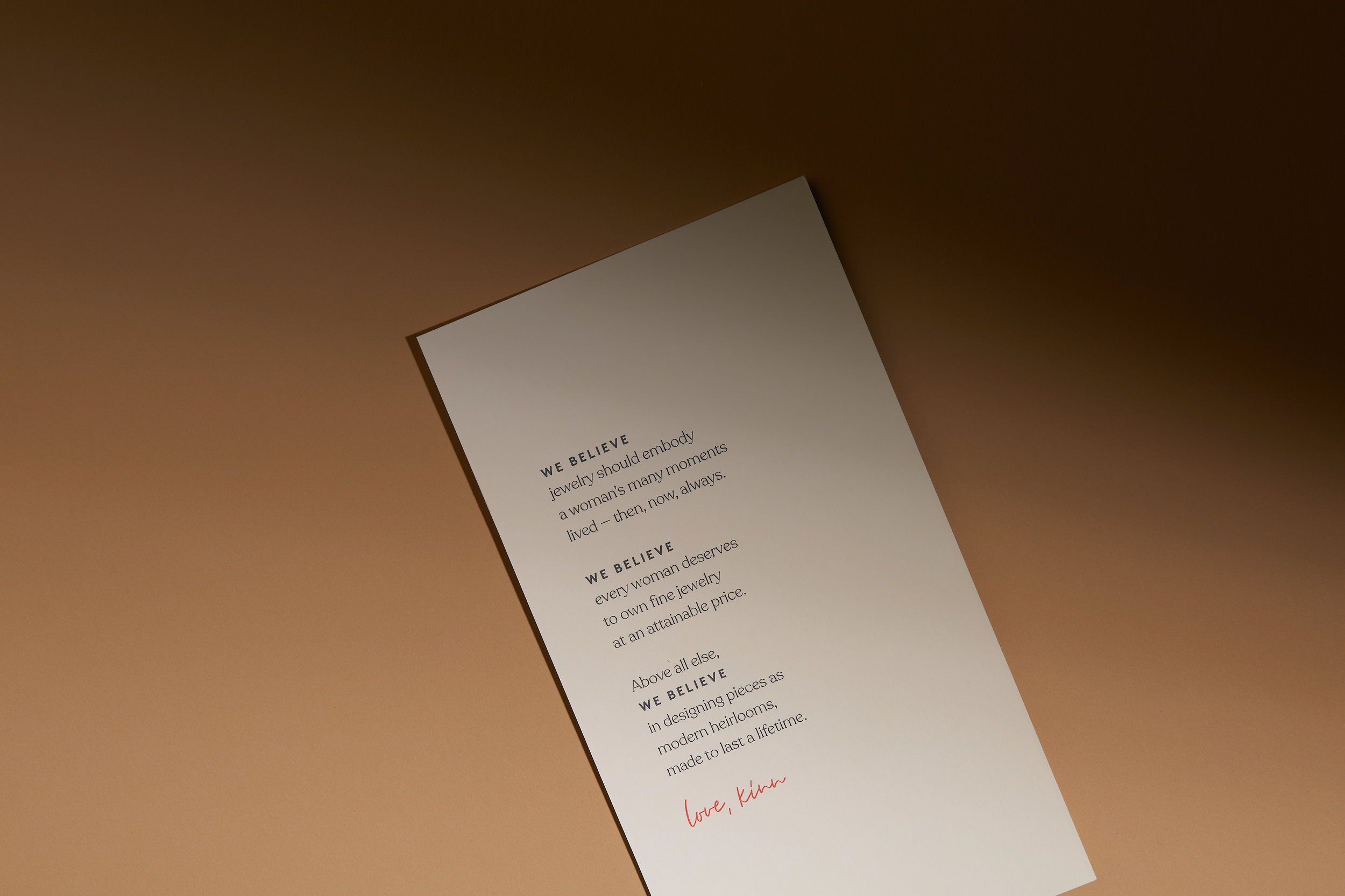
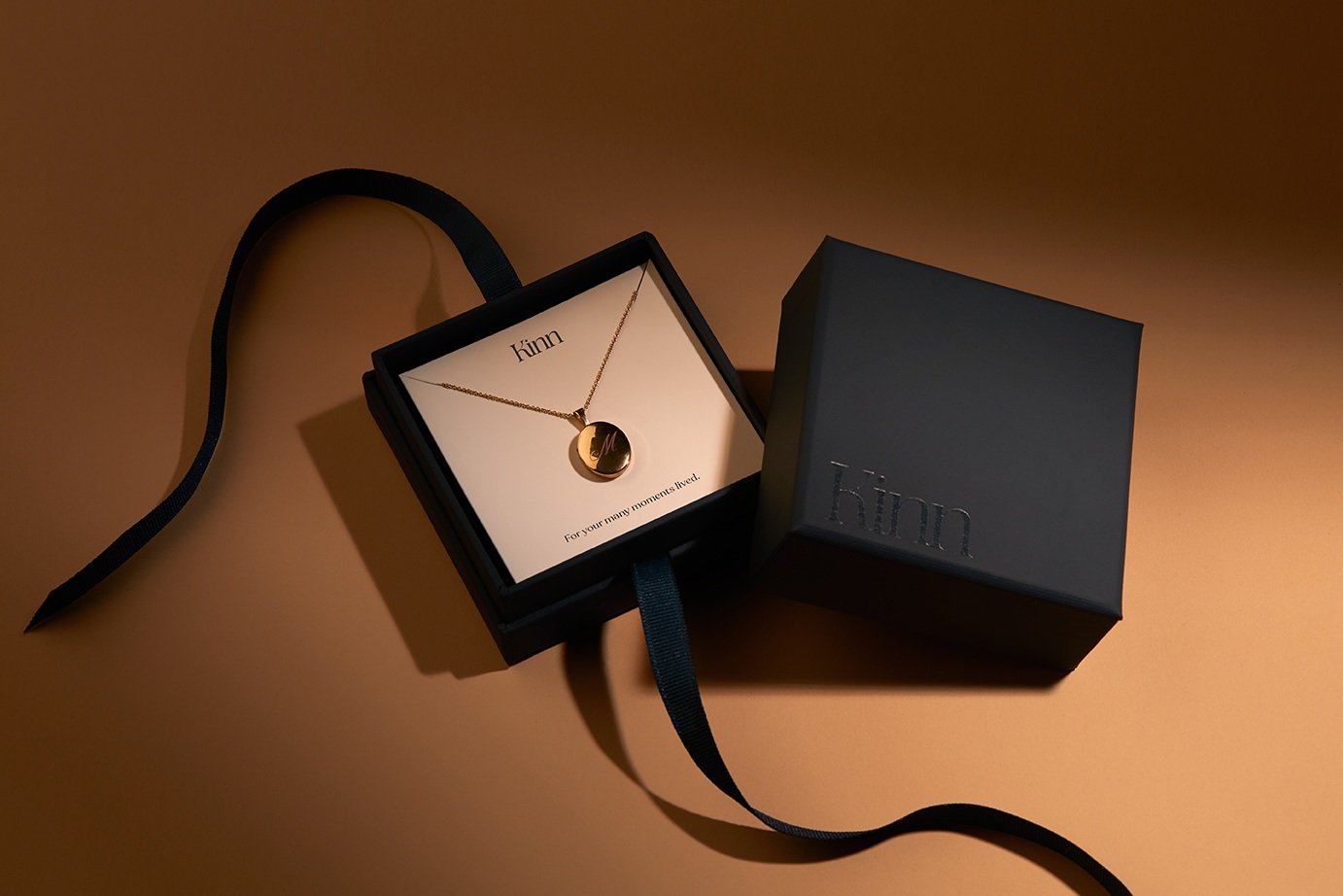
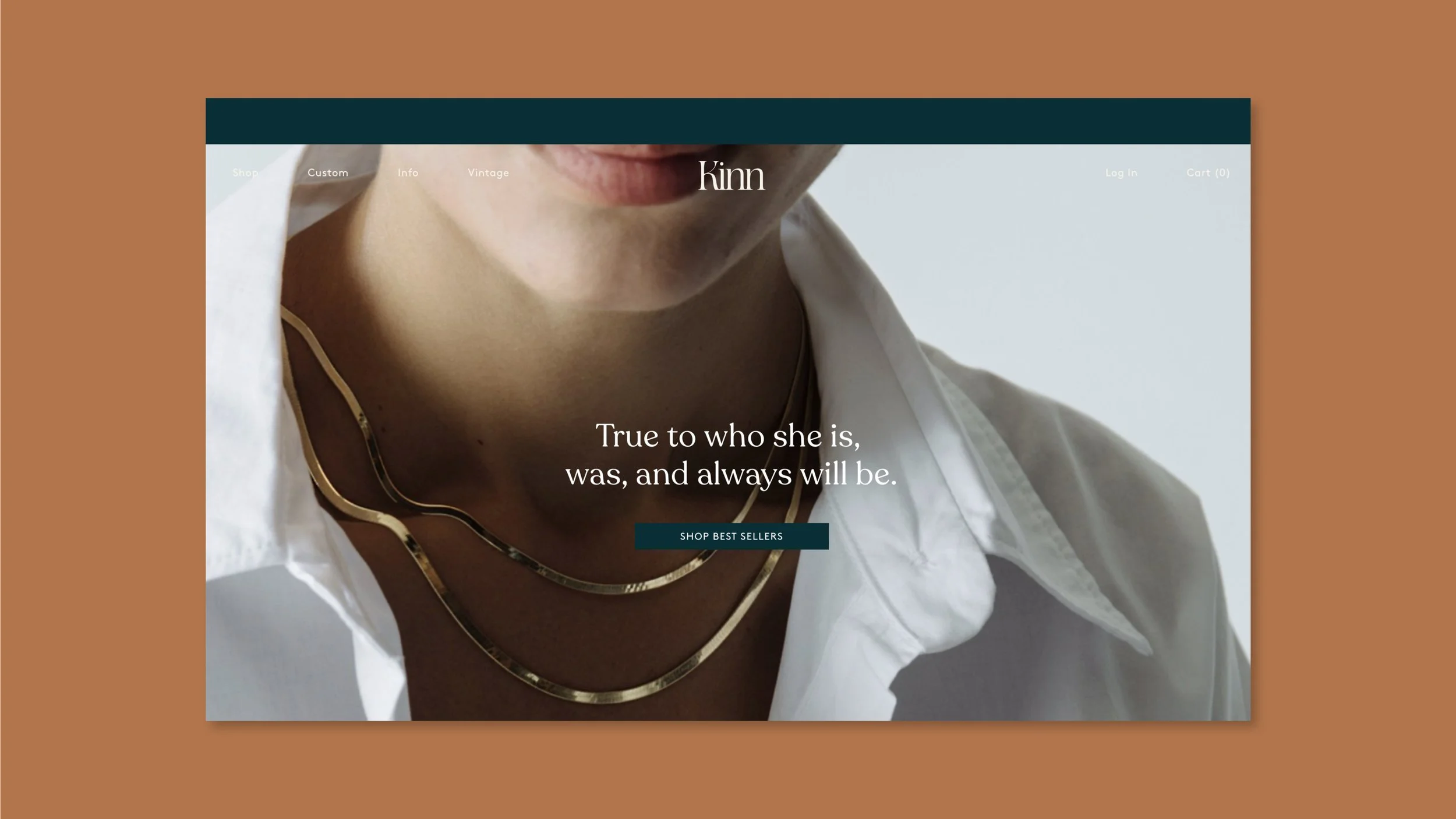
Kinn Studio entered the direct-to-consumer fine jewelry market with a specific challenge: earning trust from customers purchasing fine jewelry online. Drawing on founder Jennie Yoon’s family history, we developed a brand platform and product strategy centered on heirloom-quality pieces designed to be cherished and passed down. The work included brand strategy, positioning, voice, copywriting, visual identity, packaging and photo art direction. A feminine personality and introspective voice, infused with LA sophistication and a sultry sensibility gave Kinn the credibility of a heritage house while retaining the intimacy of a founder-led brand.
We developed “modern heirlooms” as the organizing idea for the brand work. The positioning connected Kinn’s products to memory, personal history and generational value. It moved the brand beyond everyday accessories and established a clear emotional role for the jewelry: pieces meant to be lived in now and passed down later. Kinn continues to use modern-heirloom language across its brand, retail experience and editorial coverage.
Following the rebrand, Kinn expanded from a direct-to-consumer jewelry business into physical retail. The brand opened its first permanent flagship at Platform in Los Angeles in 2024. In February 2026, Kinn opened ‘The House of Kinn’ on Bleecker Street in New York’s West Village. The modern-heirloom positioning remains central to the brand’s product language, retail experience and editorial story.
WE DELIVERED
Brand Strategy + Positioning
Voice Direction
Copywriting
Taglines
Visual Identity
Logo Design
Packaging Design
Photo Art Direction
MORE ABOUT KINN




“The Kinn branding encompasses more than the logo, the color and the typography. It is the heartbeat of our brand. It is our North Star. It is the foundation for everything we do. With this clarity, our team innovates and experiments faster. We make decisions with more confidence. We spend less time debating our identity and more time executing effectively. It’s this depth of alignment that’s driven results — not just in awareness, but in loyalty and resonance with our audience.”
JENNIE YOON
CEO + FOUNDER, KINN JEWELRY